Monday, November 30, 2009

design guide.

I like to match. And it has to be a perfect match. I can drive myself crazy running all over town to find the perfect shade of purple shoes to match a purple purse I bought (which I still haven't found!) So when it comes to your branding I think everything should match. And that is often hard when you have a graphic designer create your marketing materials and you want your twitter background to be the same but don't want to fork out the bucks just for a color match. Of course I wouldn't mind doing that for you but I want to make things simple so I created a design guide. I'm offering complimentary design guides with every purchase. Yes, that's right complimentary with every purchase!

Here is what you'll get.

Color swatches with RGB, CMYK and Pantone guide along with fonts all on one easy to reference card.

AOD-design-guide

How bout them apples?

Image Hosting by PictureTrail.com

monthly goal meetup. december.

Monthly Goal Meetup

I found this great idea on Modish Biz Tips blog and I have been wanting to do it for a couple of months now but I have been procrastinating (maybe I should have included as a goal!)

To participate in the meetup:

-Post a list of your business related goals for December, along with your checked off November goals if you'd like, on your own blog.

-Come back here and leave a link to your post in the comments (*If you don't have your own blog to post to, feel free to just leave your list of goals right here in the comments to play along!)

-Then, check out everyone else's lists as they leave comments here- click their links, hop to their blogs, say hello, meet and greet and support each other because that's what it's all about! And if you've participated before, maybe try to say hi to a couple new participants you're unfamiliar with this time around.

Since this is my first one I don't have any November goals to cross off.

December Goals:

1. Complete listings on Etsy.
2. Design sample wedding paper suite.
3. Design wedding marketing brochure.
4. Mail marketing postcard to small startup businesses.

I sure do hope I can get through these this month. What are your goals?


Image Hosting by PictureTrail.com

Thursday, November 26, 2009

happy turkey day.

EatMoreHam

Well at least the turkeys will be happy if we followed this. lol I'm not much for turkey, but I will be gobbling till I wobble on some ham and other yummy fixins at my moms.

I am thankful for this blog so that I have a creative outlet, even if 2 people read it. It makes me happy. And I thank you if you are 1 of the 2 reading. :)

And of course I am thankful for my family and friends. They are my backbone.

What are you thankful for this Thanksgiving?

Happy Thanksgiving.

Image Hosting by PictureTrail.com

Wednesday, November 25, 2009

design challenge. typography. shopaholic.

This will be the last typography design challenge. Ashley commented shopaholic. She definitely is one of those. But hey, aren't we all? No? Hmmm. Well some of us can't keep our minds of shopping...

Shopaholic

Stay tune for next months design challenge.

Image Hosting by PictureTrail.com

Monday, November 23, 2009

Rich Turbin's Logo and Business Card

I got an email from Lisa Cutright of L. Cutright Photography. Lisa is not only an amazing photographer in Hawaii, she is also pursuing a career as campaign manager for Honolulu City Councilman Rich Turbin. Thus the reason for her email. Rich was looking for some tweaking of his existing logo.

Before...

Turbin_OriginalLogo_crop

After...

Turbin_Logo_Script

The changes started with shortening Richard to Rich and bringing the blue to more "ocean-ly" (as Lisa put it) blue. I then brought the palm tree up and changed the shape to give it balance.

Lisa also needed a business card for Rich with his new logo. Although, she did the design. I helped her out with making it print-worthy.

Turbin_BC_Front_FINAL

Turbin_BC_Back_FINAL

Lisa-- Thank you for being an awesome client. I can't wait to work with you again. Good luck with your photography and getting the job. You have my recommendation. I'm so jealous you get to take photos in Hawaii. Lucky lucky girl.


Image Hosting by PictureTrail.com

business cards. make them memorable.

First impressions are the most lasting. When you meet a client for the first time you are trying to win them over and get their approval. You pick out the right outfit, you put a smile on your face, you stand up straight and you attempt to dazzle them with brilliance. But what if your first impression is actually not the first time your meet in person. More often than not this is the case.

Your business card is often the first impression for many potential clients. It can be the deciding factor whether to contact you or not. If you are claiming to be in the creative business and your business card is plain and generic, do you think you will get a good response with it? Most likely not. Here are some tips to make sure you do get that call back...

Good Fit. Your business card should match your branding. It should be all about you. If you are funky and offbeat, then so should your business card. If you are a doctor, then your business card should be neat and clean. Don't be afraid to use unusual shapes. But of course, make sure it communicates what you are trying to say.

Good Design. This goes along with good fit. If you are a photography, please include images of your work on your business card. It serves has a mini-portfolio. Remember to keep things simple though. Usually 3 images will do. More than that, the viewer will most likely not be able to see what differentiates you from other photographers. This works well for those who are not in the photography business as well. Whatever your product is, visuals are good aids and more memorable. Your design should be clear and legible. No fine print or pixelation please. Also, colors should be complimentary and not take away from the overall design. And it should go without saying to check spelling and grammar.

Card Stock. Printing at home is a cheap alternative but it lacks the professional look and is not a good quality paper. They usually have perforated edges that can make your design look tacky no matter how good it is. Spend the extra money to have your business cards printed on good quality card stock. Your cards are being passed around and put into wallets and purses. You want them to last, right? Also, choose the card stock that is right for you. If your business is all about being green, make sure your card is made from recyclable materials. Glossy, also makes business cards look sleek and professional.

This is my business card...

business-card_front

business-card_back

Photographers business cards...

JessCumbieBC_Front_FINAL

JessCumbieBC_Back_FINAL

BusinessCard_Back_Preview

BusinessCard_Front_Preview

And check out Rich Turbin's here.


Image Hosting by PictureTrail.com

Friday, November 20, 2009

blabs. cruel universe.

Ummm, where exactly did November go? Better yet where exactly did the year go!? Thanksgiving is next week, really? Oh well, bring on the food! (Just keep the calories please.)

I think the universe said "Amanda, you had way too much fun last week so this week you shall be miserable with a cough and cold and on top of that you have to work and do your finals through it all. Not to mention an ATM will steal your money and give you the wrong card back" Well I'm saying to the universe. "BRING IT ON!"

No people, I can not make this stuff up. This is really how my week went. But I'm still alive and now I will revel in a marvelous weekend with New Moon (yes I'm one of those) and celebrating Bernei's birthday at Harmonious Monks.

What are your plans for this weekend? Perhaps you will get your Edward and Bella fix like me?


Image Hosting by PictureTrail.com

Thursday, November 19, 2009

october birthday bananza.

I think half the world was born in October which made for a busy month for me. Here's a recap of the designs I did to help the birthday boys and girls celebrate.

Shane turned one on October 1st. His mommy (my bestie) threw a big party complete with a bouncy, cotton candy and monkeys. The colors were yellow, green and brown. Here's the invitation that went out...

ShaneFirstBirthday_Privacy

And here is the Birthday Card I gave the little cutie...

ShanesFirstBirthday_Card

Ashley's step daughter's birthday is on October 2nd. Autumn turned 13 and had a pink, yellow and zebra slumber party that is sure to be talked about for years. Ashley became the next HWTM for both Shane and Autumn's parties. Here's how the girls got invited...

Slumber-Party-Invite_Privacy

And here is my birthday wish to her...

GrungeBday

Ashley herself (yes she kept me busy) also had a birthday on the 24th. She said she wanted a big check for a million dollars. Of course I couldn't deny her of this.

BigCheck_Flowers
It was printed on shimmering blue card stock. (Forgot to take a photo.)

Last but not least we had Hunter's birthday. He turned 1 on October 30th. Hunter is my little cousin and couldn't be more adorable. He celebrated with a jungle themed party.

Jungle Scene_Privacy
Yes, I drew the animals!

My card to him...

Card

Don't you just love birthday parties? I know I do. Well at least the cake part. hehe.

Image Hosting by PictureTrail.com

Wednesday, November 18, 2009

design challenge. typography.

I planned on having a typography post for ya'll last week while on vacation but it didn't work out that way. And I didn't get any word suggestions either. Shame shame. So I am going to do something a little different and show you a wedding invitation concept I created.

The premise...

High school sweethearts get married at their high school.

The colors: white, black and gray.

The theme: classroom

The invitation: blackboard

Blackboard_WeddingInvite

So what do you think? I think the use of typography in wedding invitations is important. It sets the tone. With the wrong type used it could throw the whole thing off and not convey the message properly.

Since, I slacked I'm going to give you some extras this week. These are posters I have done using letters and words. Enjoy.

These were given has baby shower gifts. How cute would they be framed in a nursery?

KinleyGrace_K

Jayden Elizabeth_J

How 'bout them GATORS?

Gators_UF

And last but not least...This one I did for Tara to say thanks for her help the week of my website launch.

Crazy_P


So does anybody have a funky word for me for next week?

Image Hosting by PictureTrail.com

Tuesday, November 17, 2009

blabs. bahamas recap.

Well, I originally intended to give a play by play on twitter during my vacation. However, lack of service threw that out the window. It was kinda of nice to have a technology detox. No laptop, no cell phone, heck I didn't even know what time it was most of the time.

Needless to say the Bahamas are absolutely amazing. So gorgeous and serene.

We boarded the ship around 12:30 on Monday and had a few drinks. We set sail about 4:30 and it sure was rocking...literally it was rocking. The seas were outrageous. But no sea sickness for me. Can't say the same for Ashley and Shawn though.

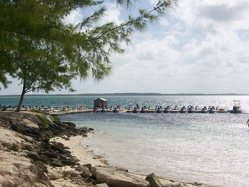
Tuesday morning we woke up in CocoCay. Royal Caribbean's private island. Can you say stunning????

102_0642

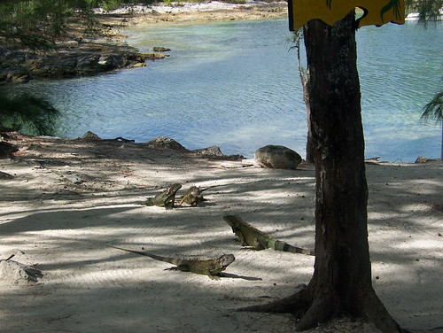
And we met some friends along the way...

102_0649

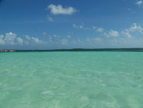
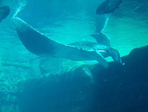
Just look at that water! We even had a sting ray swim right past us.

102_0662

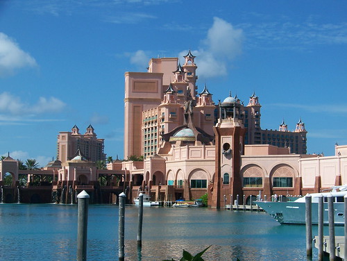
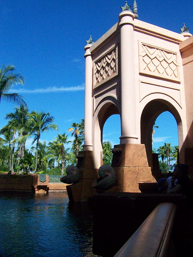
The next was spent in Nassau which is equally gorgeous. I ended up spending most of the day alone due a not so funny for my situation but hilarious for everyone else. Yep, I wrecked a scooter. Go ahead laugh it up. I'm not though! Anyways, I took the ferry over to Atlantis and finally got over my anxiety attack when I saw the architecture. Ah-maz-ing!

102_0712

102_0761

102_0766

102_0783

102_0779

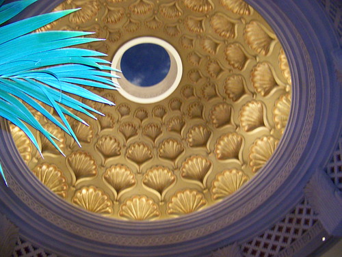
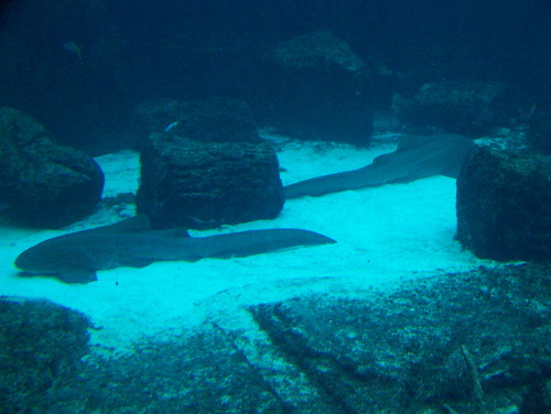
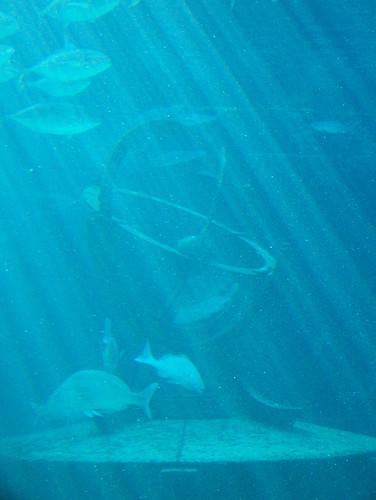
The aquarium at Atlantis was sooo pretty.

102_0757

102_0739

102_0725

Thursday we were at sea all day at joined some of the festivities on board like Men's Sexy Leg Contest, Women's Bicep Contest, the Casino (totally lost my butt!), Bingo (the same guy won 3 out of 4 games. NOT. FAIR.) and we went to the most hilarious adult comedy act ever! So much fun.

The staff was fantastic! And the food...Oh I think I ate a month's worth of food. It was always at your fingertips and somehow I never felt full. I even tried escargot...and liked it! We ate in the Dining Room every night and Tuesday night was formal night so we got all dolled up.

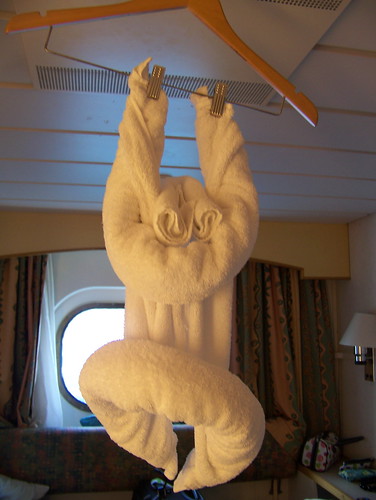
Our room attendant made us a monkey and a bat. Here's the monkey...

102_0695

Did I mention we had fun??? I'm ready to go back. Like. Now!


Image Hosting by PictureTrail.com

Sunday, November 15, 2009

weekend warrior. bulletin board.

I needed a bulletin board for my home office. But of course I didn't want to hang a boring plain cork board. That's just not how I roll. So I jazzed it up a little. Here's how I did it...

I started off with gathering my supplies.
~Cork board
~Fabric
~Buttons
~Ribbon
~Scissors
~Stapler
~Push pins
~Hot glue gun

102_0807

Then I cut my fabric about 2 inches bigger than my cork board.

102_0808

I then placed my fabric upside down and laid the cork board upside down on top of that. Next, I stapled the fabric to the back of the board, starting in the middle of each side, making sure that the fabric is pulled tight.

102_0809

To make clean corners, I folded them like a present and then stapled them in place.

102_0811

The board should like this at this point.

102_0815

I then took ribbon and made a crossed pattern securing the pieces to the back with staples.

102_0819

Taking my buttons, I hot glued them to push pins.

102_0827

Then I placed them where the ribbons crossed.

102_0834

Finally, it can be hung on the wall for all your important notes.

102_0836

I chose a fabric and buttons that matched my brand. What would you do to make a super chic bulletin board like this one?


Image Hosting by PictureTrail.com